NOTE: It's now officially official in this era of increased monetary divide that gold is here to stay.
Wednesday, 28 December 2011
Brutal Design
Île-de-Jésus (aka Laval,Québec, Canada) native Philippe Malouin has created a wonderful suspended light structure "svetko lamp" for his most recent showing of new works at the NextLevel Galerie in Paris. Out of all his past works, I beleive that this pendant is truly Malouin's pièce de resistance.
NOTE: It's now officially official in this era of increased monetary divide that gold is here to stay.
Thursday, 15 December 2011
Good Memory
Designers Hanhsi Chen and Yookyung Shin of Logical Art have created an a line of amazing 4GB usb keys. Watch out for their upcoming jewellery line.
Monday, 5 December 2011
Formal Colour Theory
UK visual artist Liam Gillick's use of colour and form is nothing short of wonderful. He has recently collaborated with Fashion label/store Pringle of Scotland to create a popup store at the Art Basel show in Miami, for which Liam created this beautiful table? stand? sculpture.
Gillick also created some great patterns for the Pringle of Scotland Spring/Summer 2012 collection:
Here are some of Gillick's other works
Liam Gillick's work for Pringle of Scotland popup store at Art Basel Miami 2011 |
Liam Gillick for fashion label Pringle of Scotland |
Here are some of Gillick's other works
Gillick's work reminds me very much of American artist Donald Judd.
Untitled Donald Judd 1963 |
Donald Judd Armchair no. 47 |
Donald Judd at the Tate Modern (untitled 1984) |
Donald Judd 1984 |
Friday, 25 November 2011
Bright Idea
Anthony Dicken's modular lighting system Tekio is clean and simple. It's a fun and playful lighting solution that is remarkably reminiscent of those flexible dryer exhaust tubes. Amazing!
Tuesday, 8 November 2011
Faux fini
If it is obviously fake, then it's ok...this is my rule. The following collection more than adequately adheres to this philosophy. In 2007 British Artist Richard Woods teamed up with designer Sebastian Wrong to create the "wrong collection" for British design retailer Established & Sons. The collection was relaunched last year.
Friday, 28 October 2011
Amazing Grace
Gifted designer Grace Tan of Kwodrent recently showcased here creation for FARM. These flexible metal bowls are a true innovation.
This beautiful design has a retro futuristic feel and reminds me of Paco Rabane's iconic fashion designs from the 1960's.
Friday, 21 October 2011
Colour Theory
Polish designer Bashko Trybek's recent project "serpent" is as beautiful as it is functional. This simple and sophisticated shelving system illustrates visually that form follows function.
Serpent shelving unit by Bashko Trybek |
See some of Bashko Trybek's other creations below:
Diamonds low table |
AntiStress chair |
Wednesday, 21 September 2011
Molecular Window Dressing
French sculptor and store window designer Arnold Gorcon has created a masterpiece with his latest store installation in Paris. Created for fashion boutique Isabel Marant, this installation is meant to showcase molecular structures. These structures, made of styrofoam balls and sharpened wooden segments, are suspended from the ceiling and rotate around the mannequins in the store windows.
Friday, 9 September 2011
Postmodern Furniture
This gorgeous table made from glass, wood, steel and even concrete stays true to it's materials in every way, conforming with the traditions taught at the BAUHAUS in 1920's. The unique, one of a kind creation by Jonah Takagi presents however a different take on that ideology. Far from refined functional minimalism, this table reminds me of late 80's/early 90's postmodern architecture, (but much nicer). Especially with that round centre column.
It actually reminds me a bit of the clock tower of the city hall erected during my childhood in Mississauga Ontario. Designed by Edward Jones and Michael Kirkland, and completed in 1987, Mississauga city hall adopted the popular postmodern deconstructivist style in the design of the building's clock tower. I always used to wonder when they planned on finishing that part of the building, thinking that perhaps they ran out of money.
Range Life table by Jonah Takagi |
Mississaug, Ontario, Canada - city hall 1987 |
Tuesday, 6 September 2011
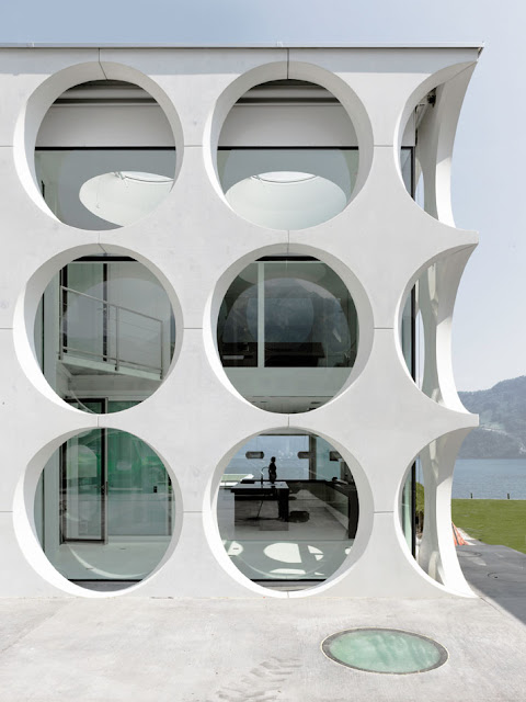
Holey Houses
This beautiful home in Switzerland designed by Philippe Stuebi Architects employs a magnificent concrete façade in front of the home's windows.
The O-House |
This house makes me think of the old funeral home on my street in Montreal that is currently undergoing a reno/conversion into condos. The building is a simple quadruplex built in the early 1950's that was converted into a funeral home (in the 60's I would guess) by erecting a giant concrete wall made of octagonal concrete bricks. The contractor has fortunately decided to retain this monolithic wall for the new condo reno currently in progress.
Funeral Home on Bannantyne Ave. in Verdun, Montreal, QC Canada |
Friday, 2 September 2011
More Canadiana
Nice ipod/iphone clock radios by Montreal duo FURNI. Check out all their cool and very affordable designs at http://www.furnicreations.com
.
Alba "Media Edtion" |
Subscribe to:
Posts (Atom)